![](https://kyo2.com/wp/wp-content/uploads/works-_004_01-1.jpg)
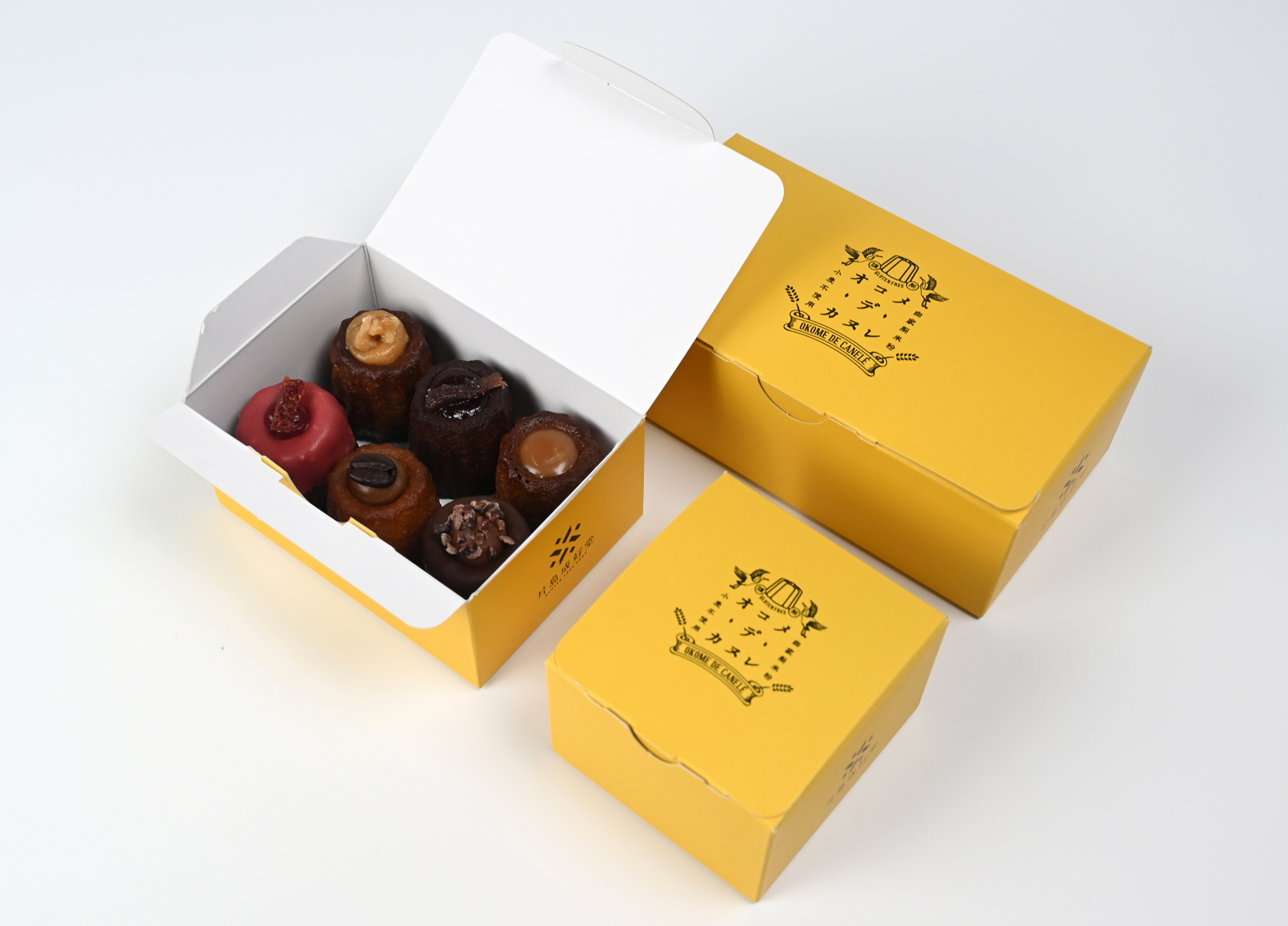
黄色をキーカラーにした店舗ブランディングデザイン
- CATEGORY
- BRANDING / ブランディングデザイン
- DESIGN TOOL
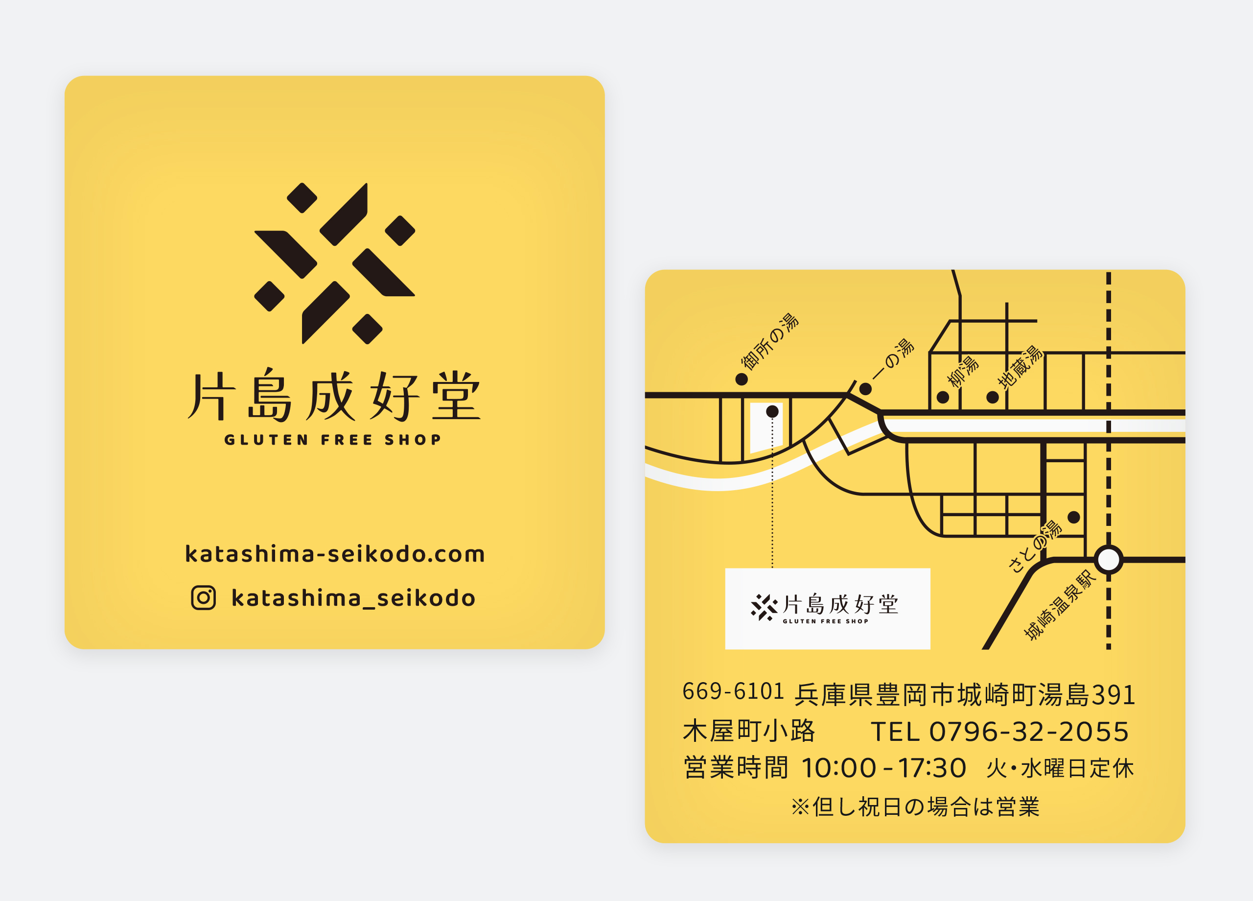
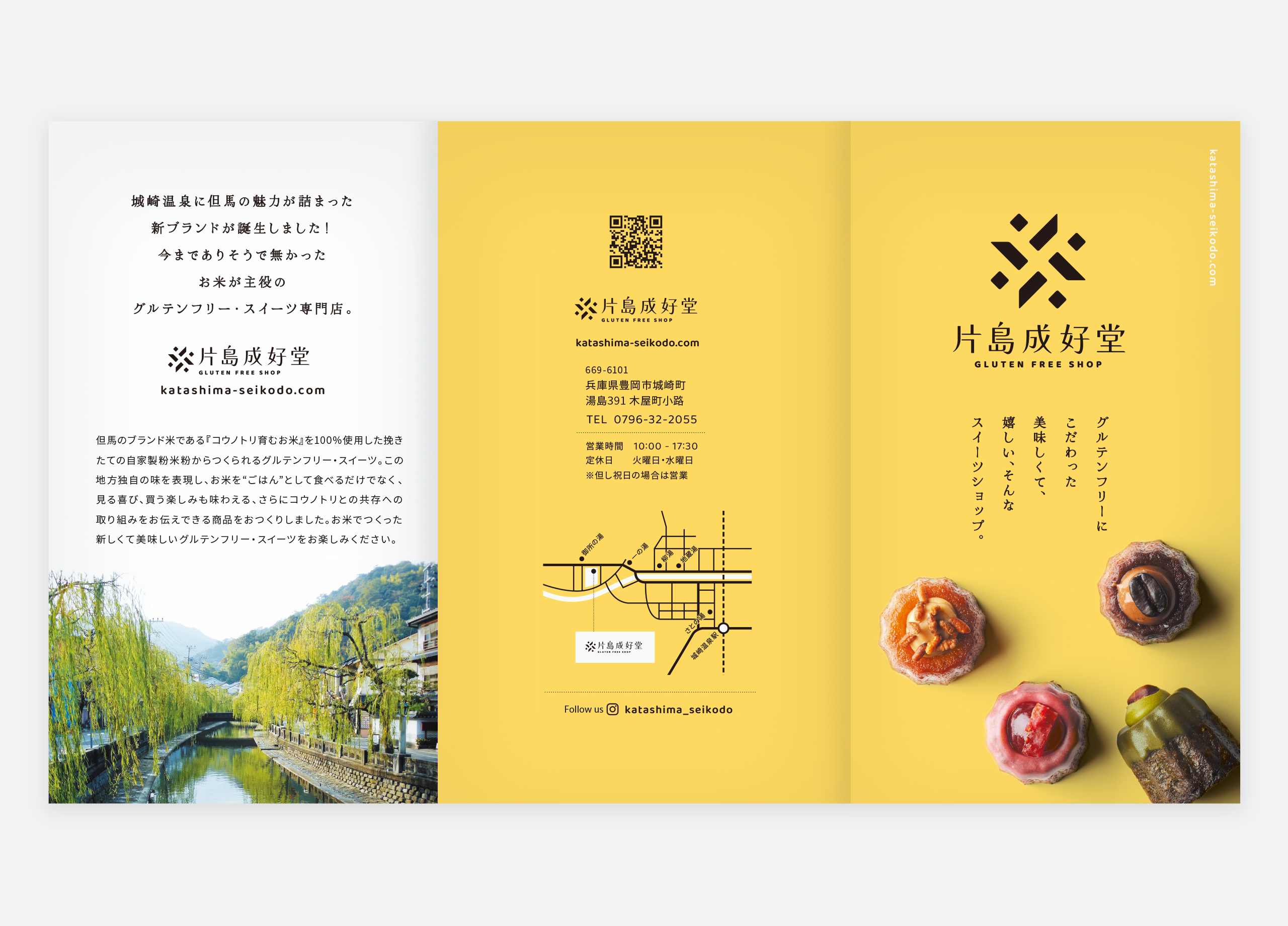
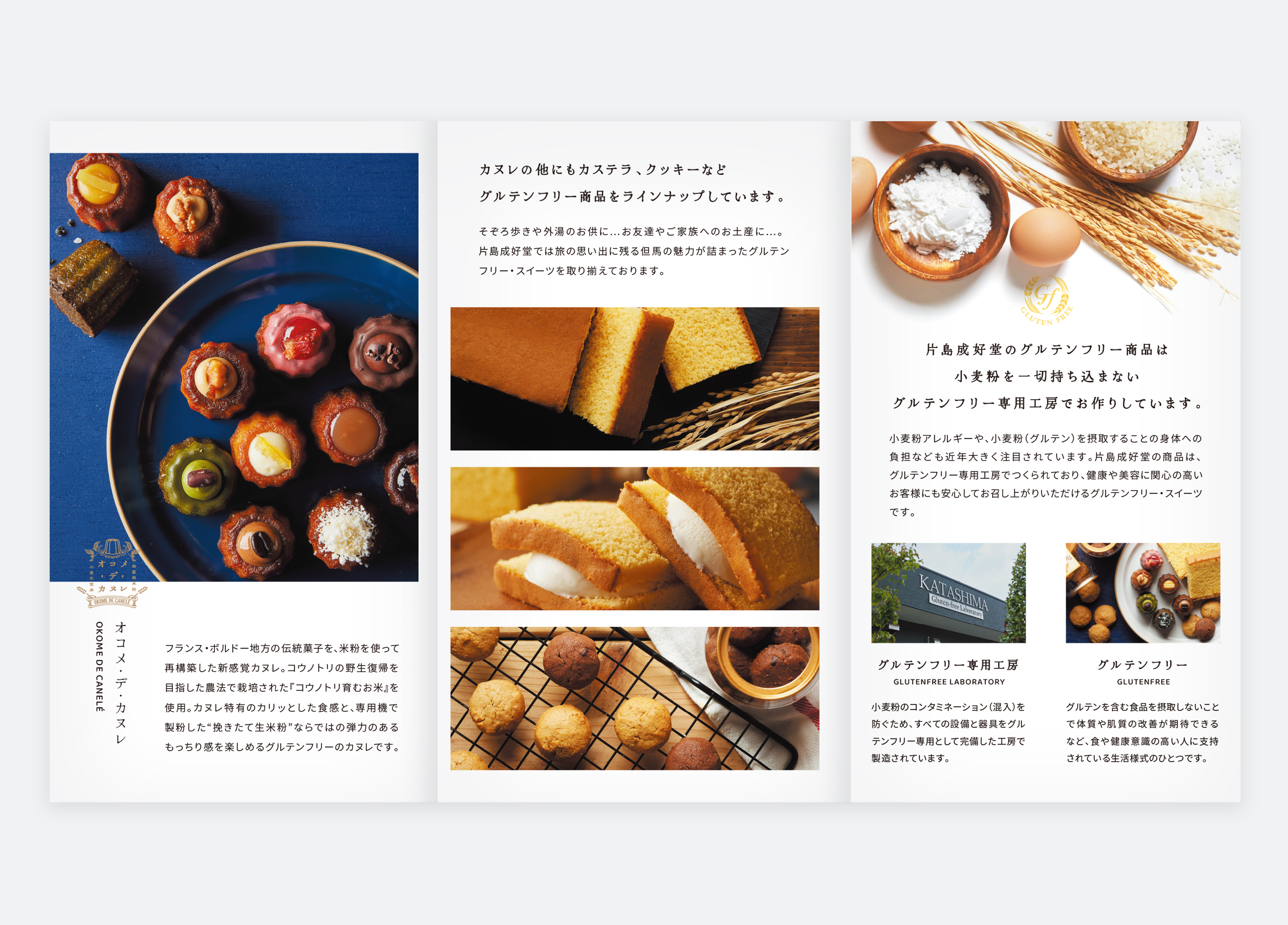
- ロゴマーク、ショップカード、パンフレット、チラシ、WEBサイト、サービス箱、店舗サイン
- CLIENT
- 片島成好堂
- WEB SITE
- http://www.katashima-seikodo.com
- AREA
- 兵庫県豊岡市
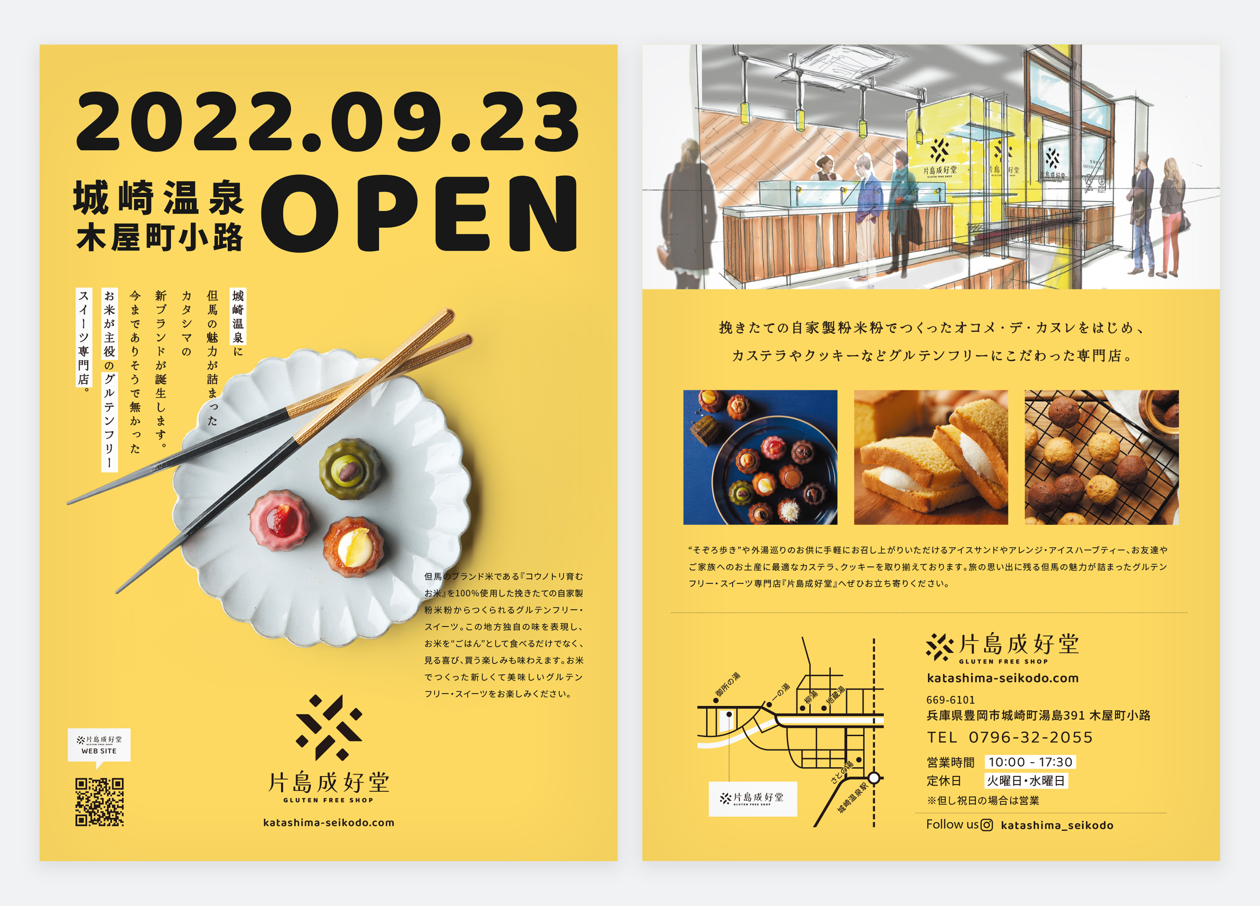
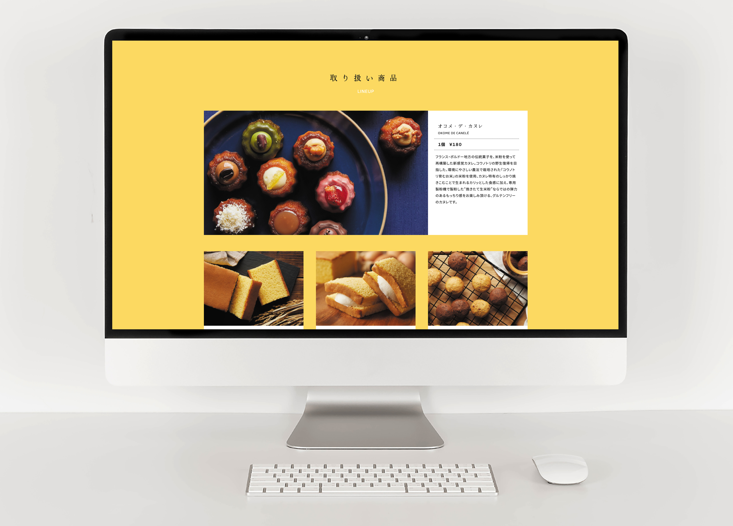
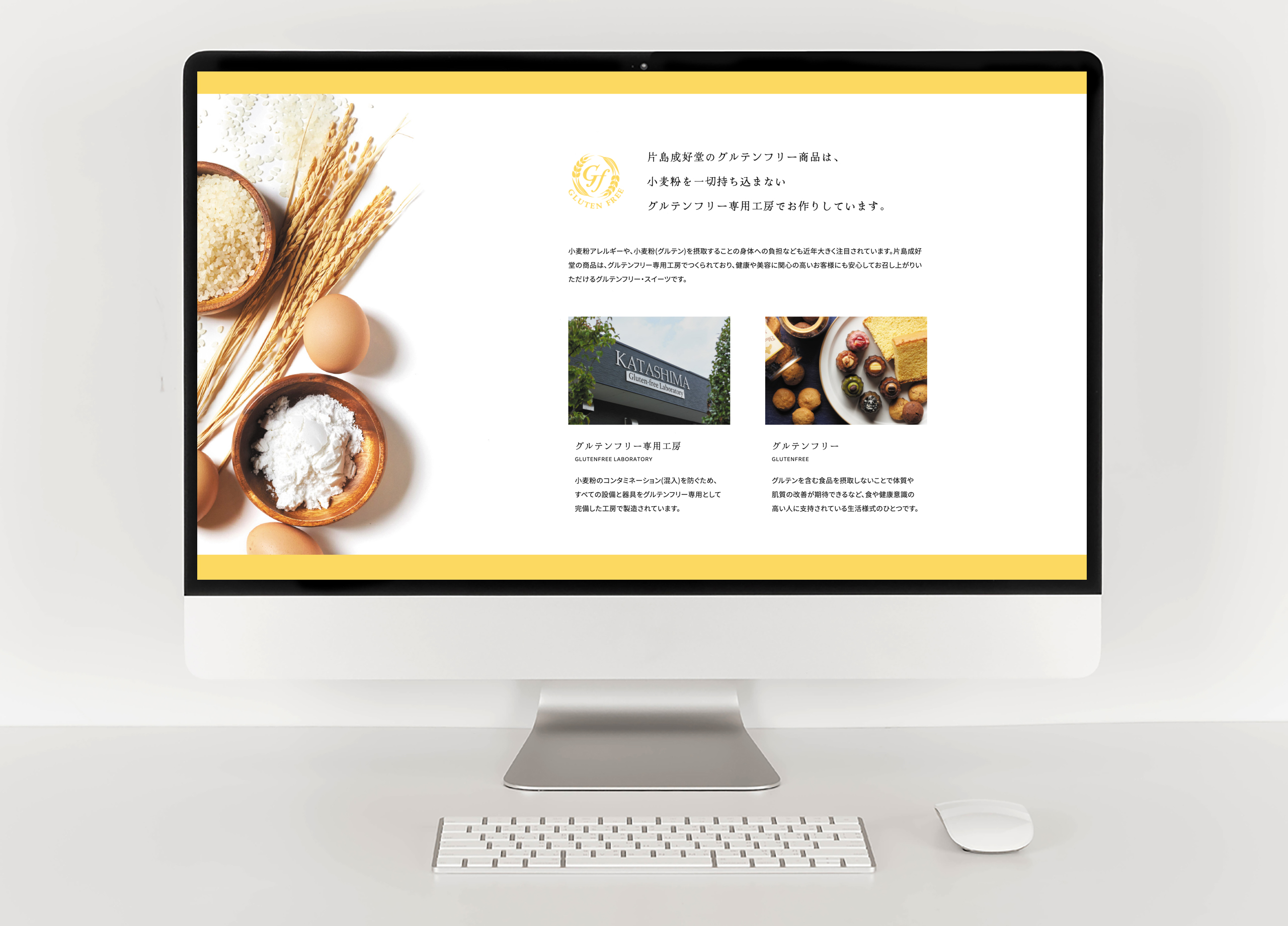
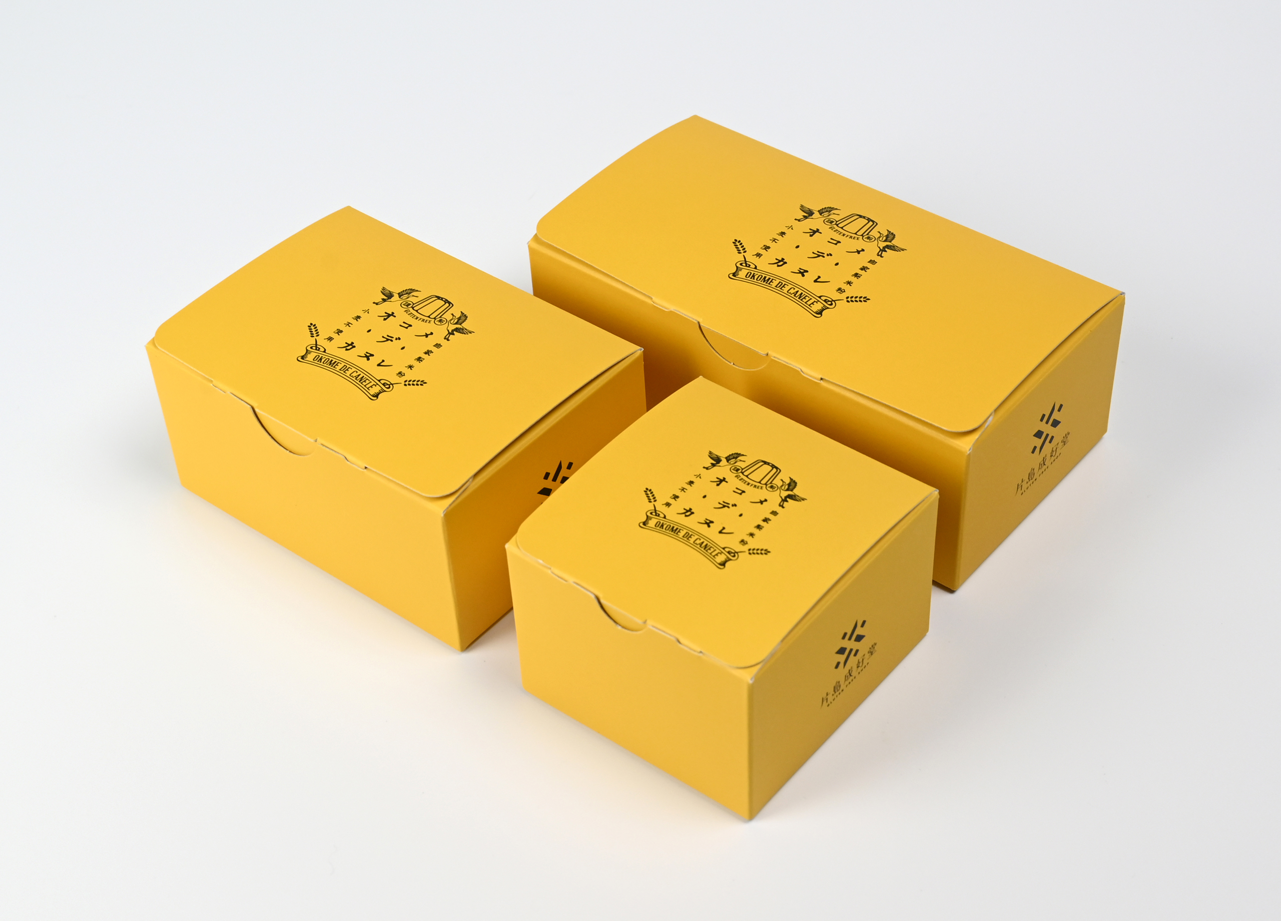
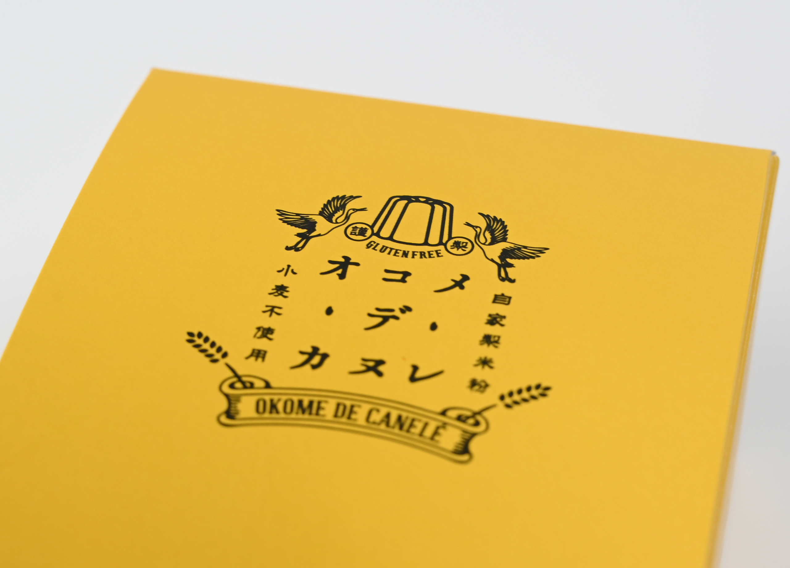
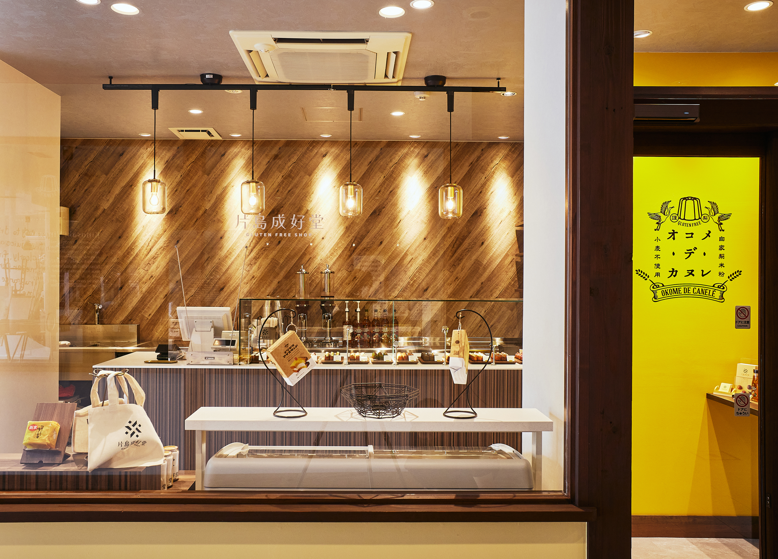
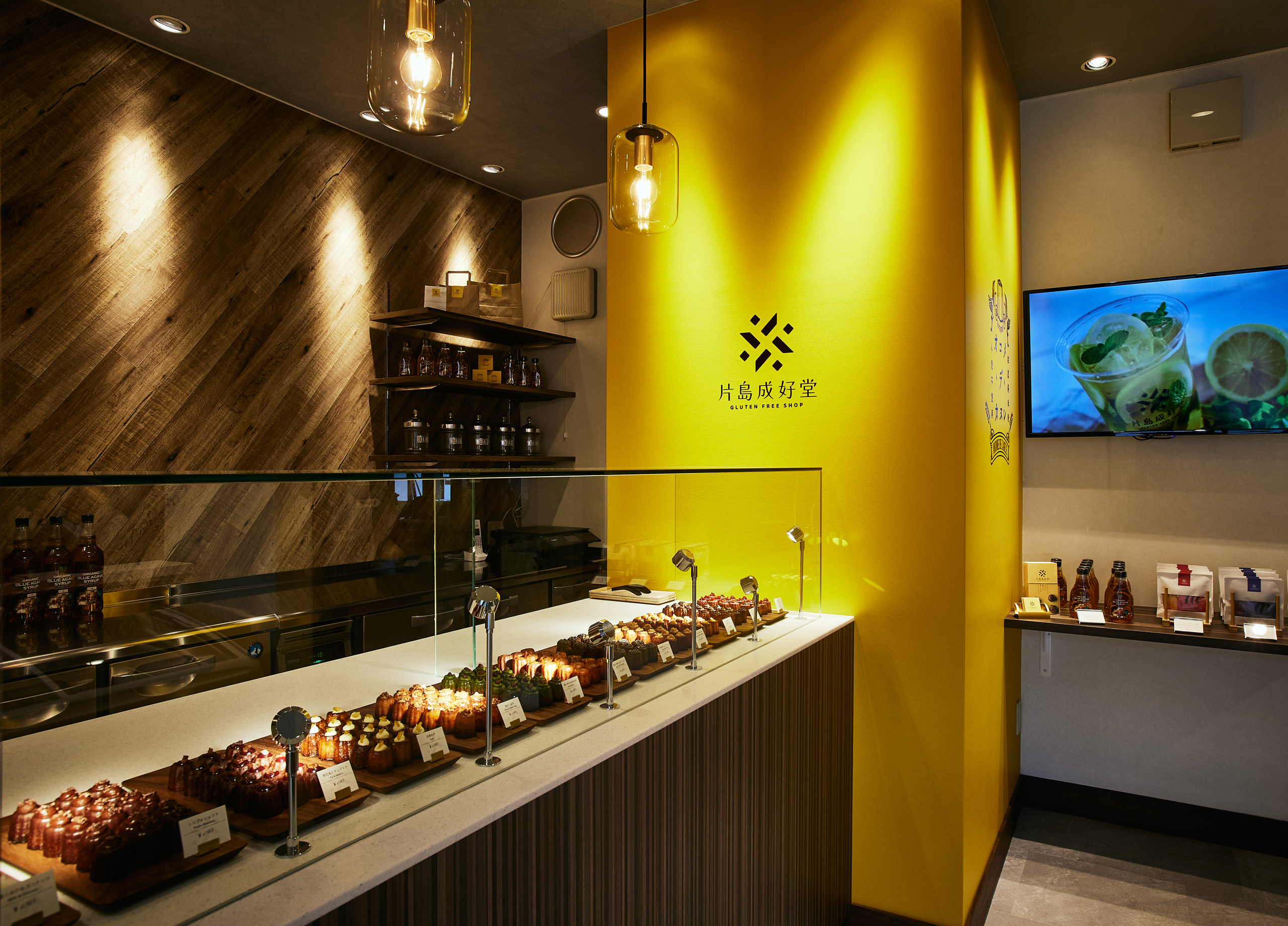
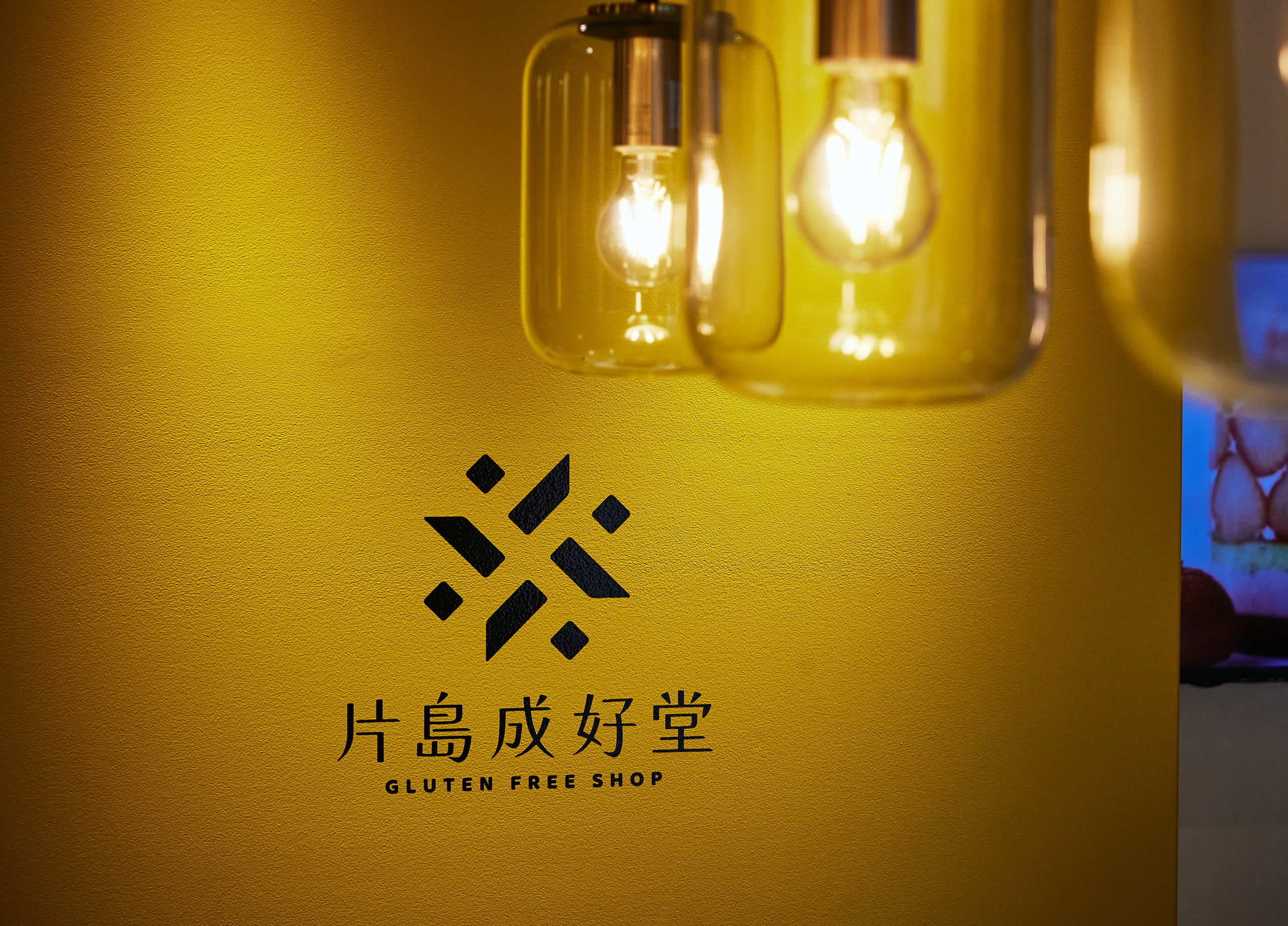
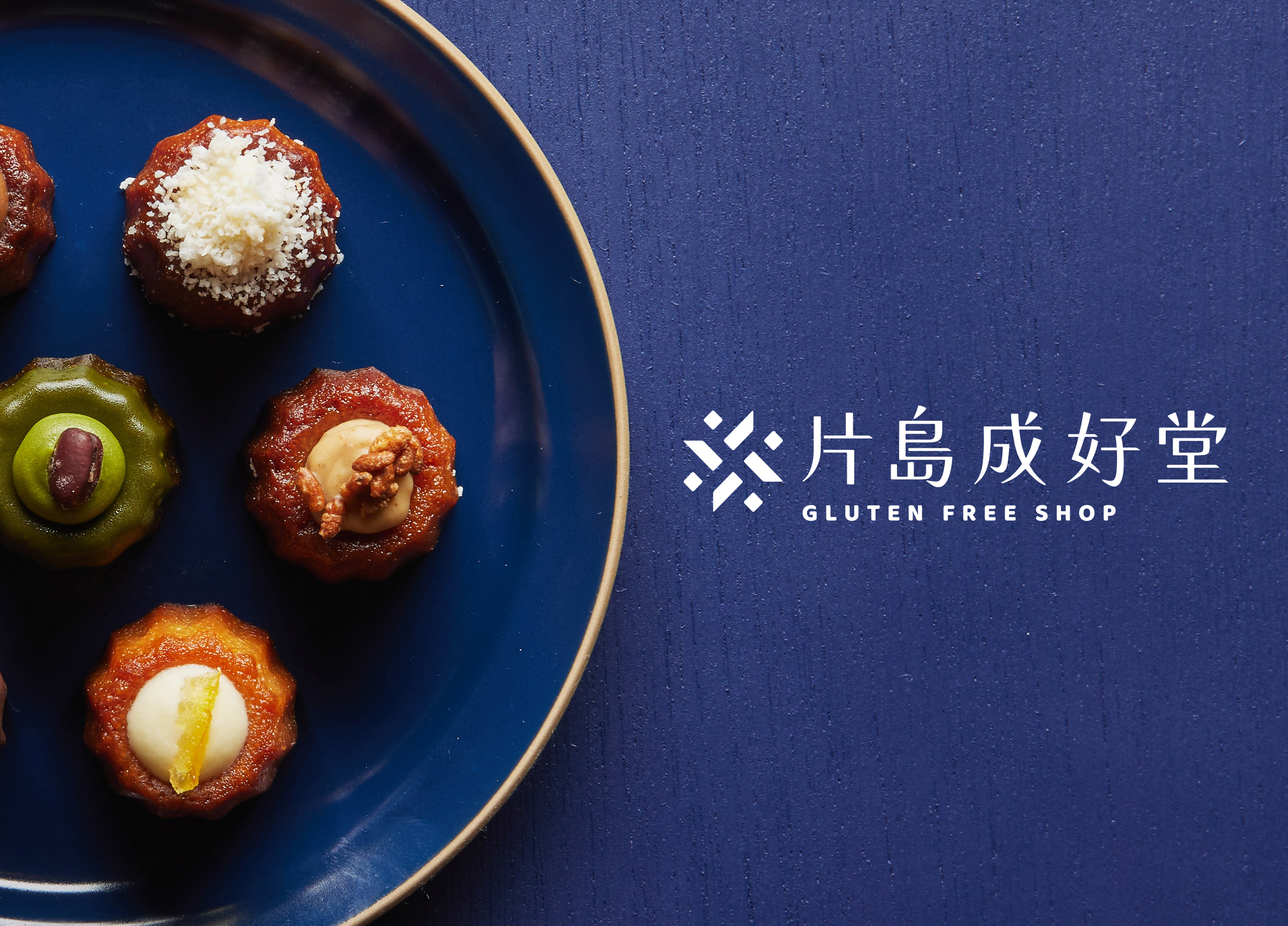
カタシマ株式会社様の新業態グルテンフリー・スイーツ専門店「片島成好堂」のブランディングデザインです。
黄色をキーカラーにブランドを展開しています。
城崎温泉という立地から、少し落ち着いた印象の黄色を使用することで、環境に馴染みながらも目立つような仕上がりになっています。
![](https://kyo2.com/wp/wp-content/uploads/works-_004_02-1.jpg)
![](https://kyo2.com/wp/wp-content/uploads/works-_004_03-1.jpg)
![](https://kyo2.com/wp/wp-content/uploads/works-_004_04-1.jpg)
![](https://kyo2.com/wp/wp-content/uploads/works-_004_05-1.jpg)
![](https://kyo2.com/wp/wp-content/uploads/works-_004_06-1.jpg)
![](https://kyo2.com/wp/wp-content/uploads/works-_004_07.jpg)
![](https://kyo2.com/wp/wp-content/uploads/works-_004_08.jpg)
![](https://kyo2.com/wp/wp-content/uploads/works-_004_09.jpg)
![](https://kyo2.com/wp/wp-content/uploads/works-_004_10.jpg)
![](https://kyo2.com/wp/wp-content/uploads/works-_004_11.jpg)
![](https://kyo2.com/wp/wp-content/uploads/works-_004_12.jpg)
![](https://kyo2.com/wp/wp-content/uploads/works-_004_13.jpg)
![](https://kyo2.com/wp/wp-content/uploads/works-_004_14.jpg)
![](https://kyo2.com/wp/wp-content/uploads/works-_004_15.jpg)